Steri-Stumpie
Logo Redesign, Concept, Illustration & Packaging
Working on this brand was a real treat... Over the years working in different packaging agencies I got the privelege to work on the South African great - Steri-Stumpie twice.
Whilst working for Berge Farrell as a Junior Designer I was in the group that redesigned the logo that has become a shelf classic for years. Going for something less round and more unique the logo was well-received and continues to set it apart from other competitors on shelf.
My concept was
Proudly South Africa - Back to the 70s
BRIEF
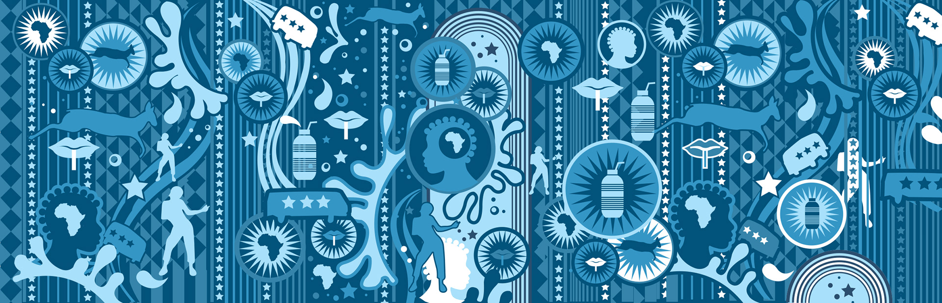
Whilst freelancing at Fountainhead I was briefed to update the label creative (not the logo) - try something more unique with not taking away from its iconic attributes. Steri-Stumpie is known for its bottle shape, it's sweet, milky flavours - "everyone has a favourite" and that it's a true South African heritage brand.
CREATIVE
I did an illustration that was reminiscent of the 70's psychedelic other world shapes.
The 70s is when the product was launched. I added proudly South African elements such as
jumping Springbok, a combi bus combined with some African patterns. Rainbows (South Africa is known as the rainbow nation and there are a rainbow of flavours in between and splashes and bubbles of joy. I added liquid roads and layers of splash elements. Steri-Stumpie is a fun brand so I pitched to change the names to a "Fanagalo" type language - a very interesting language that was created by South Africans that shortens and combines languages so that words are understood across language barriers - South Africa has 11 official languages.